


On March 26, 2018, Google made the official announcement surrounding the rollout of the often-discussed, long-anticipated mobile-first index. Countless SEOs and many digital marketers have stayed laser-focused on this development since it was first announced in 2016. All things considered, this should come as no surprise, as mobile searches account for over half of online traffic.
We know an excellent mobile UX is important. We know Google is prioritizing this experience for users. But what’s next? Here’s how to succeed in the mobile-first landscape of 2018:
Understand Your Site Configuration & Respond Accordingly
In response to the mobile-first index migration, Google has provided a list of required changes for various site types. This is an exceptionally helpful resource – I’ve translated their list below:
| Site Types | |
| Desktop onlyYour site is desktop only and doesn’t have a mobile-friendly version. | No change. The mobile version is the same as the desktop version. |
| Responsive web designYour site adjusts for screen size. | No change. The mobile version is the same as the desktop version. |
| Canonical AMPAll your web pages are created in AMP HTML. | No change. The mobile version is the same as the desktop version. |
| Separate URLsEach desktop URL has an equivalent different URL that serves mobile-optimized content. This site type is also known as an m-dot site. | Google prefers the mobile URL for indexing. To prepare for mobile-first indexing, follow our best practices. |
| Dynamic servingYour site serves different content based on the user’s device. Users only see one URL. | Google prefers the mobile-optimized content for indexing. To prepare for mobile-first indexing, follow our best practices. |
| AMP and non-AMPYour site has both AMP and non-AMP versions of a page. Users see two different URLs. | Google prefers the mobile version of the non-AMP URL for indexing. If your non-AMP mobile version uses dynamic serving or separate URLs, follow our best practices. |
Monitor Search Console
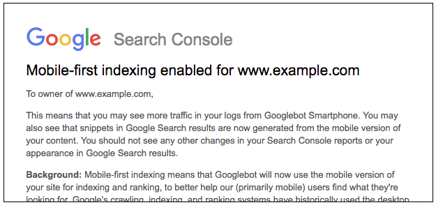
In an encouraging gesture of transparency, Google mentioned it would notify websites through Search Console when the mobile-first migration has been completed for the given site. Shared below is an example of what webmasters should keep an eye out for within the Messages section of GSC:
The Google Search Console mobile usability report will remain a vital resource, as this dataset provides webmasters with complete visibility into mobile issues that may be plaguing a site’s performance.
Errors commonly featured in this report surround the following concepts:
- Flash Usage
- Viewport Configuration
- Font Size
- Tap Element Spacing
So why is this important? Besides the mere fact that we should always strive to provide the best-possible experience for our users, Google has made no secret surrounding the repercussions of a non-mobile-friendly website. This still holds true with the updated index. If you have content that is not mobile-friendly, it will not perform well.
Address the Technical
We’re unapologetic about our love of creating great content, be it on mobile or desktop, but even the best website content needs to check a list of technical boxes to be successful. With the mobile-first index in mind, our technical checklist includes:
- Speed: A seemingly never-ending venture, continue to improve your mobile site speed. It will only help to improve your post mobile-index results.
- Structured Data: Structured data can potentially help your website earn rich search results, higher click-throughs and more traffic, all from a mobile device. Webmasters should be using it, and they must be sure to include the same structured data markup on desktop and mobile versions of the site.
- Hreflang: If necessary on your site, mobile hreflang should direct to mobile versions of each URL. Desktop URLs should direct to desktop variations.
- Sitemaps: While you do not need a mobile sitemap, it is vital to establish a link to your sitemap from the mobile version of your brand’s site.
Welcome Your Audience with Mobile Content
Searchers behave differently on a mobile device versus a desktop machine. Users will often have very specific intent and utilize a much different set of behavior (looking at you, “near me” queries) on their phone, as opposed to the desktop. Google recognizes this and often ranks keywords on a mobile device and desktop differently.
When developing your content strategy, it will prove valuable to separate your mobile-targeted and desktop-targeted queries accordingly. For instance, the desktop terms will likely be most appropriate when mapped against long-form, deep pieces of content that speak to searchers nearing the end of their decision-making process.
On the contrary, mobile keyword targets are often most effective when mapped against local pages or those which serve quick, easily-consumed results, also known as micro-moments.
Update Your Reporting
At the most foundational level, be sure to feature traffic arriving from desktop contrasted with that which lands from mobile. A high-level insight is certainly better than none at all, but the mobile-first index allows (or demands) you to take your SEO reporting a step further.
Consider breaking your core reporting metrics into both desktop and mobile views. This reporting segment would likely include engagement metrics such as bounce rate, time on site and pages per visit. Additionally, webmasters can better assess mobile performance by reporting on landing pages and overall conversions separately.
Mobile responsiveness and overall usability are worthy of time, effort and resources. SEOs have been preaching this for some time now, so chances are, your website already provides a strong mobile experience. If that’s the case, rest easy and be proud of serving your users a rewarding experience, regardless of device.
If you’re left scratching your head and wondering how you can improve your brand’s mobile presence in a post mobile-first index world, Volume Nine would love to help! Contact us to learn more.